Share
- Jump to:
Digital access is important for your restaurant. Why? Because your customers would rather order directly and they're looking for you online. In 2021, 67% of customers would actually prefer to use a restaurant's native app or website for ordering as opposed to a third-party service or other means of ordering. In fact, consumers ordering delivery digitally from restaurants have spiked 123% from 2019-2020, largely due to the pandemic. So the best thing you can provide your customers is access. Easy access and a seamless transition from your physical space to your digital space.
When designing your restaurant website, much like real life, think about what your customers are looking for and all your different types of customers. Today, we have customers who like to order standing in line, those who are too busy to stand in line, and those who like to reserve ahead for seating. Some prefer delivery, some pickup, and some are a blend of it all. The most important thing you can provide are options – options to order, to reserve, and to experience your restaurant in a way that makes sense for the modern consumer.
So, let's get into the nitty-gritty of what makes a good restaurant website. It's nothing complex, in fact, it should feel just like stepping into your own physical space. You have a menu, a host (your online reservation system), a server (*ahem* throw to Lunchbox online ordering), and your food on display (in this case it's the menu photography instead of a server walking by with a yummy plate of food).
Designing Restuarant Website: What To Include on Your Brand’s Website
Let's pretend that we've just stepped inside your restaurant. What do you see when you first walk in? Is there a menu on display? Is there a host? What does it look like? You obviously put effort into designing a welcoming atmosphere. Can you smell and see the food? When the customer orders, do they have the option to "build-your-own"?
Our main goal here is to mimic that in-store experience online as best as we can. If we keep the above in mind while building a website, we’ll be able to transfer the warm, welcoming feeling (or in Night Owl Cookie’s case, a neon pink paradise) of your restaurant or cafe to your digital storefront.
1. Your menu.
It’s pretty typical that the first thing potential customers consider when choosing a restaurant is the menu. It’s arguably the most important piece of content you can have on your website. What is equally important is having your restaurant menu up to date, and formatted properly for the web in HTML so that it is searchable and mobile responsive.
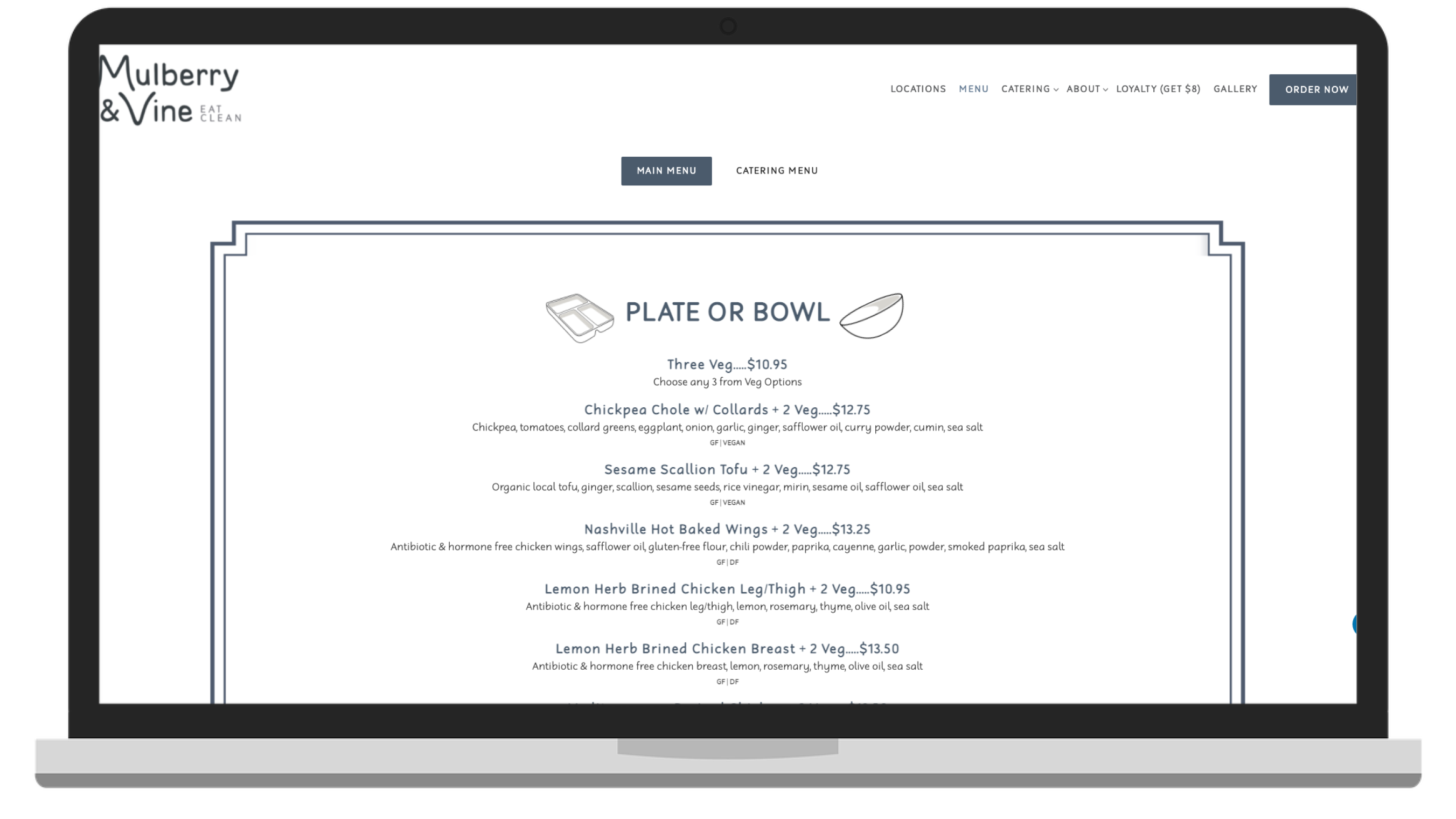
In the example above, Mulberry & Vine has done a great job of showcasing their menu in rich text, with a toggle to switch to catering. They’ve also intelligently included links out to their online ordering system for the customer should they get hungry after reading through. The menu is fully responsive for mobile devices, and their site includes accessibility options for those who need it.
Just like the customer standing outside your restaurant’s window, peering at the menu, the digital customer is looking here first too. Make sure menus are easily accessible from the navigation menu, or even right on the home page as Shake Shack has done on their website.
2. User-friendly online ordering.
There are a lot of things to consider when setting up online ordering. If you’re not building your own in-house system, a good digital partner like Lunchbox who provides multi-channel support in the digital ordering space can help you get started.
With the 123% spike in digital ordering this past year, approximately 33% of customers are saying online ordering is extremely important, and 31% are saying the same about mobile/app ordering. Not having online ordering could be the difference between a customer choosing you for takeout, or a customer searching for a more convenient alternative and landing on a competitor or third-party platform instead. It’s crucial for your business to capture that wallet share and encourage customers to come to you by including online ordering options on your website.
If you have online and mobile app ordering available, highlight it front and center on your website. In the case of Saxby’s, a chain of coffee shops located in Philadelphia, PA, they feature their app right on the home page with an extra incentive to download in the form of a $3 first purchase offer. In addition to the home page, the online ordering button appears on every page of this website anchored in the footer of the pages.
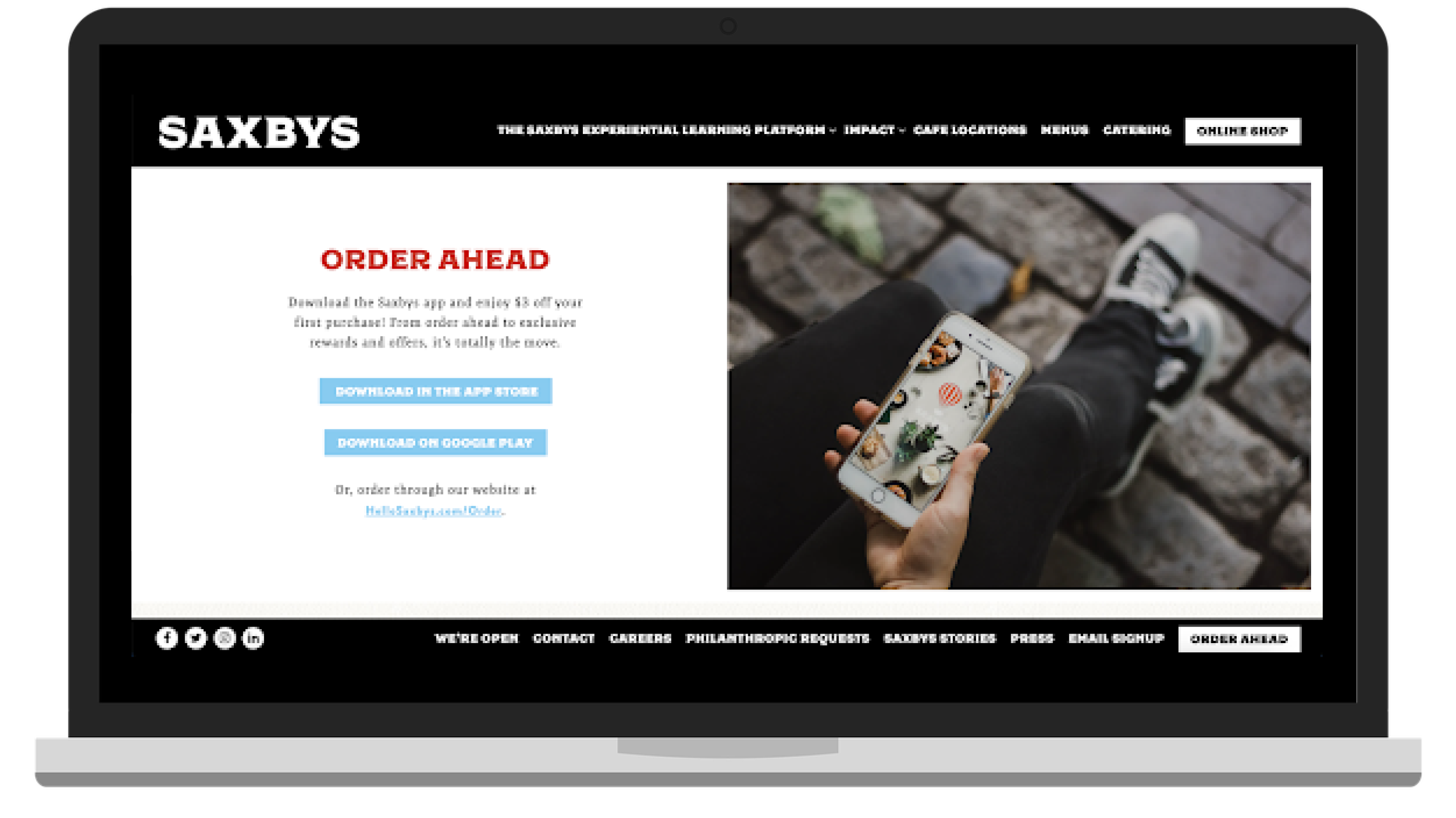
Image: Saxby’s Coffee
If you’re just starting to look into online and mobile ordering for your business, or if you’re curious what makes a good online ordering experience, here are a few key factors to pay attention to.
Menu Parity
Customers should be able to have the same experience ordering from your online menu as they do standing in front of your menu boards at your brick and mortar locations. If a customer is not able to modify as they are used to in-store, they won't be as engaged with your online platforms and customer retention will drop.
Pro Tip - remove certain modifiers from your third-party platforms as a means of driving traffic to first-party platforms.
Support
Choosing a reliable partner is important. Chat with fellow restaurant owners and see which providers they’ve had a good experience with. How is the support team? Does the platform integrate with your POS? What does support in growing your user base post-launch look like?
User Experience & Real-Time Feedback
A bad user experience will churn customers from your app in no time. The best thing you can do is pay attention to what your customers are saying. Make sure you’re providing an outlet for them to send feedback in real-time, check your app store reviews, and ask your customers when they come in to pick up!
There are plenty of tools you can use and ways you can incentivize your customers to provide feedback. Lunchbox provides in-app feedback functionality, automated email marketing to collect feedback, and integrates with tools like GatherUp, Tattle, and Ovation.
3. Enticing photos matter.
If only the smell of your wonderful food could permeate through the walls of the internet. While we’re waiting on Elon Musk to figure out how to send smells through the cloud, the next best thing we have digitally is high-resolution food photography. Here are some tips:
Use high-quality images. If you can, hire a good photographer.
If you’re photographing food, make sure that’s your main focus and eliminate clutter. You can include the packaging, and utensils, but keep the food your focal point.
Presentation is key! Watch a YouTube video on plating and presentation, use the ingredients as props, and make sure your lighting is on point.
Be sure to include photos of your physical space. Atmosphere can be a major factor in choosing a spot to eat.
We also break down 10 tips and tricks for a deeper dive into restaurant business photography.
4. Online reservations and contact information.
Make it easy for your customers to visit you. Platforms like Resy, or Open Table are great options to have on your website for reserving a spot at the table ahead of time, and they even have the added benefit of discovery through their marketplace-style platforms.
This is a basic of restaurant marketing, but important to reiterate: your phone numbers and email addresses per location should be visible. A best practice is to have this information available in multiple places: as a footer to every page, your home page, and a ‘Contact Us’ or ‘About Us’ page.
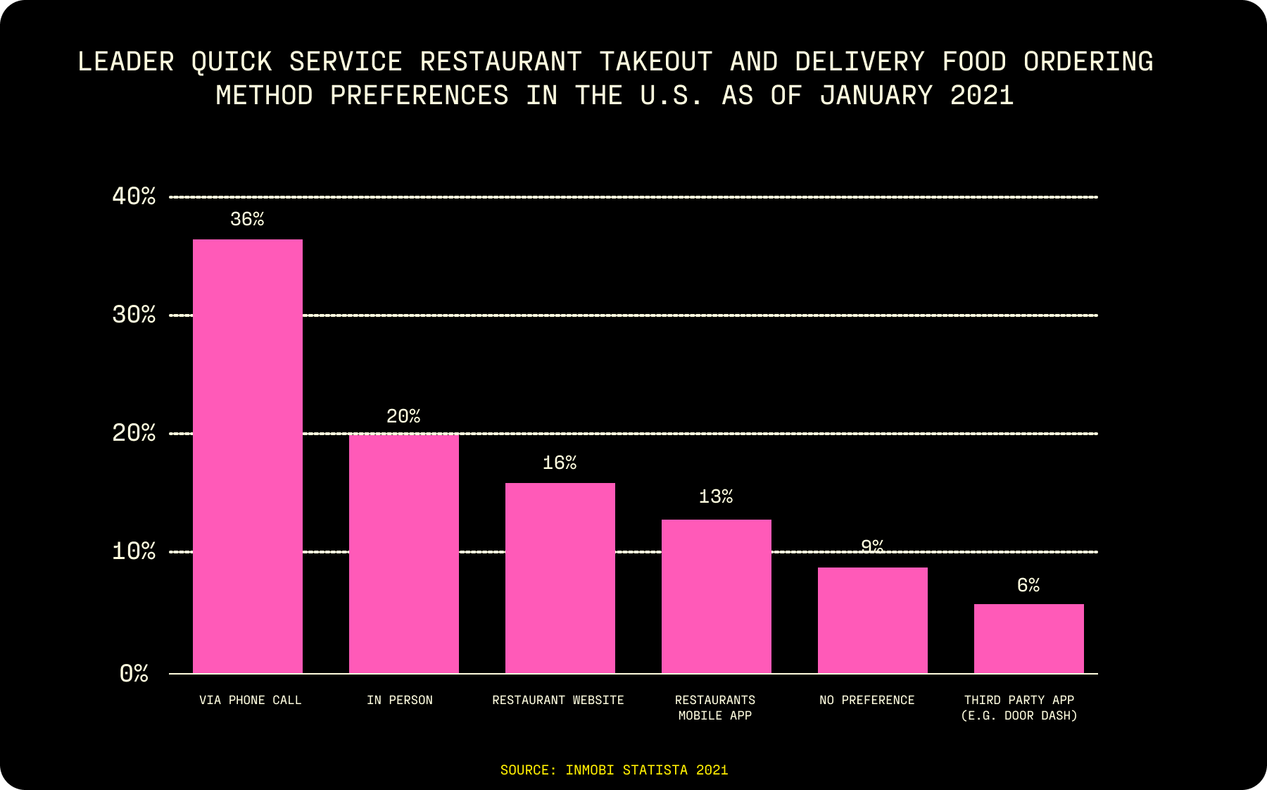
And if you think phone calls are dead, think again! Phone calls are still the number one way consumers order ahead from restaurants in 2021 according to the study below from Statista.
5. Link to social media.
You’ll have a plethora of different types of customers visiting your site. Some know your brand well and for others it’s their first impression. What they likely have in common is that mostly all have landed there to learn something about your restaurant – whether that be the type of food you sell, your story, how they can order, or where you’re located to name a few. In addition to your “about us” page and all of the above, include links to the social media pages for your brand.
Linking out to your social media platforms is a great way to engage your audience outside of your dining experience and welcome into your community. One of the best ways to keep your website visitors curious, up to date, and engaged after leaving your site is through a social following.
6. Consider special offers and highlight customer loyalty programs.
A report from Restaurant Dive shows us that 47% of customers use at least one restaurant’s loyalty program, and 60% of customers already on one loyalty program said they would spend more with other brands if they had a program for loyalty.
Including details about your loyalty program on your website is a great way to encourage your customers to join your first-party platforms and increase ordering frequency for your business. On top of that, once customers enroll in your loyalty program, place an online order, or download your app, the opportunities to communicate with those customers vastly increase.
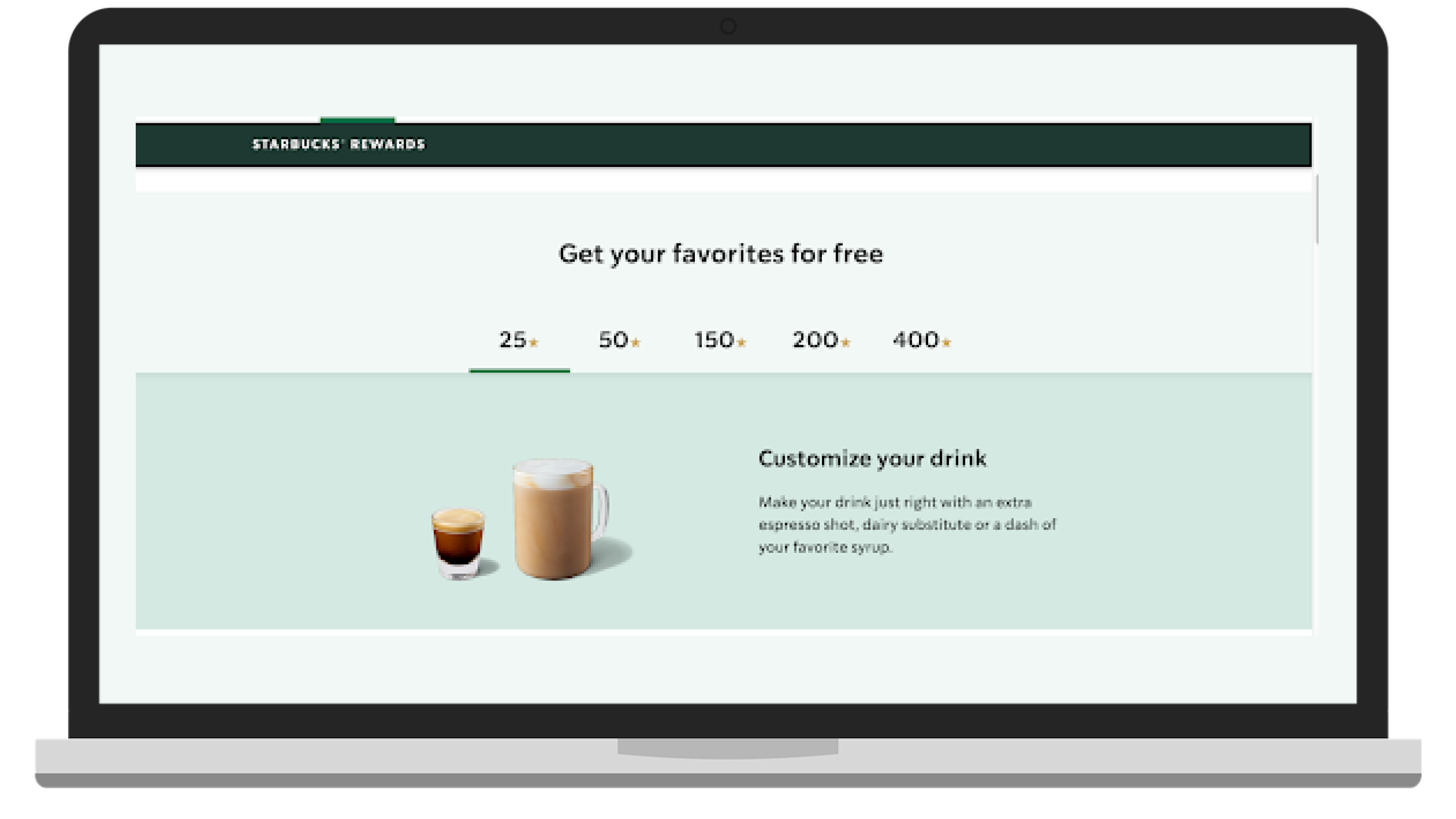
Starbucks really nails optimization. They do a great job of simplifying their website so that the most important things to their customers and the most profitable drivers for their business are front and center. With the sticky nav consisting of just three buttons: menu, rewards, and gift cards, it’s super easy to navigate. And we all know Starbucks does a good job of converting consumers into loyal customers.
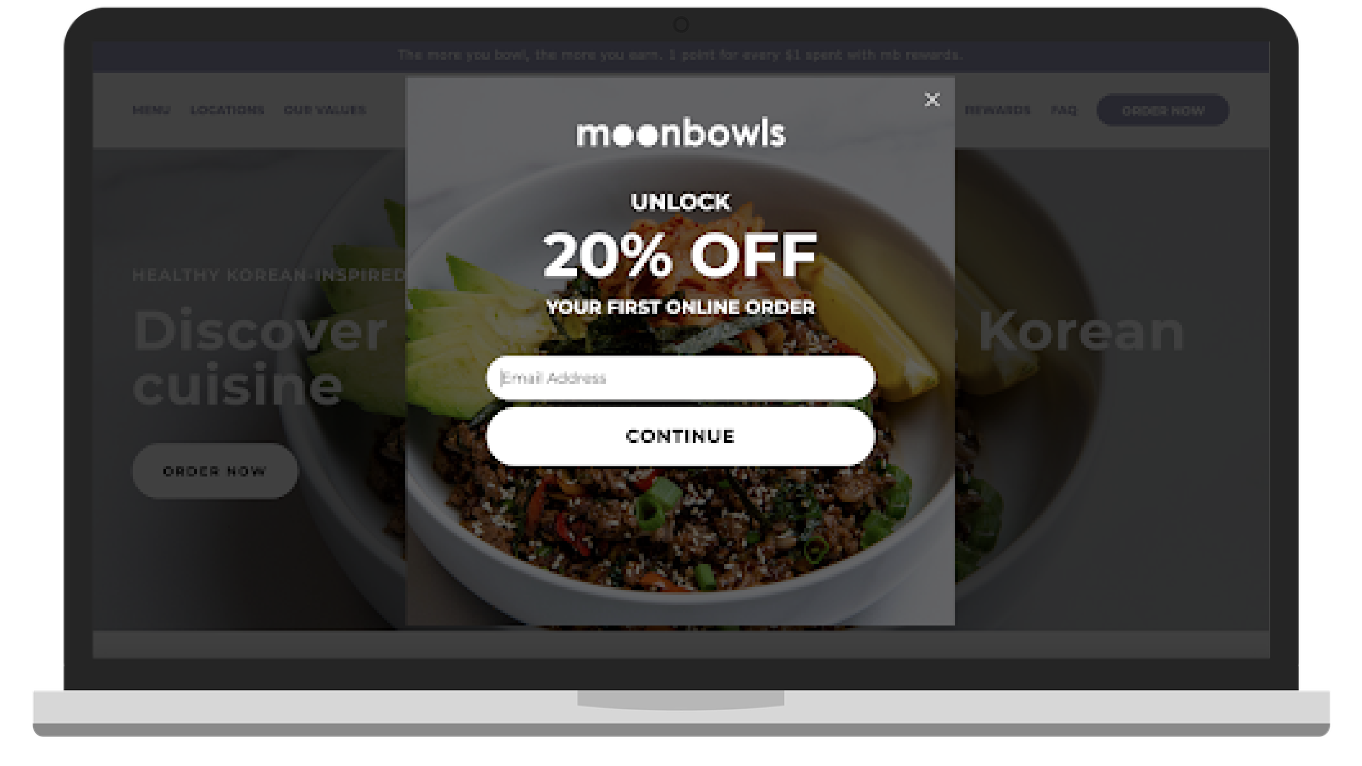
Heading to Moonbowls website next, upon landing on the home page you’re greeted with a popup offer to unlock 20% off your first order. Popups paired with sign-on offers are a great way to incentivize downloads while growing your email list at the same time.
7. Encourage email sign-ups.
A well-placed email form with the right copy can do wonders for growing your subscriber base. Email marketing is an easy way to keep your customers informed on seasonal specials, limited-time offers, and interesting brand stories. You can even automate email communication by creating workflows targeting customers who complete events like subscribing through the form, making a first purchase, unlocking a new reward, or those who haven’t placed an order in a while.
A few good tools for creating email forms are:
Email forms can live within the pages themselves, and/or as popups when someone first lands on a page. Consider adding an incentive to subscribe, like a percentage off their first order, an opportunity to unlock exclusive content or rewards, or tease early access to seasonal specials and members-only events.
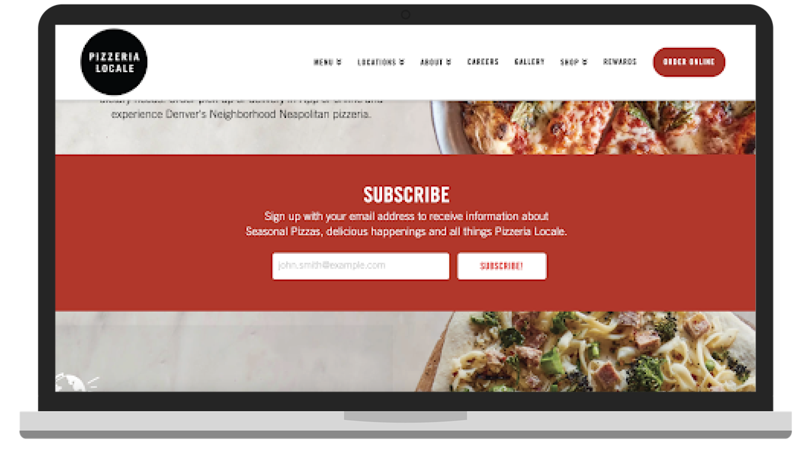
Image: https://www.pizzerialocale.com/
8. Highlight your brand's story.
Customers order from brands they know and trust. A great way for your customers to get to know you and start building a relationship with your brand through your website is an ‘About Us’ page. This is a space for you to tell the story of how your business came to be, your company mission, and what type of food you serve. It’s also a great place to include photos of you and your team, employee bios, and even the company dog.
A favorite ‘About Us’ page is from The Grey Dog in New York, NY. Not only do they have a great story and give back to the community, but they also take the care to shout out all of their local vendors and community partners.
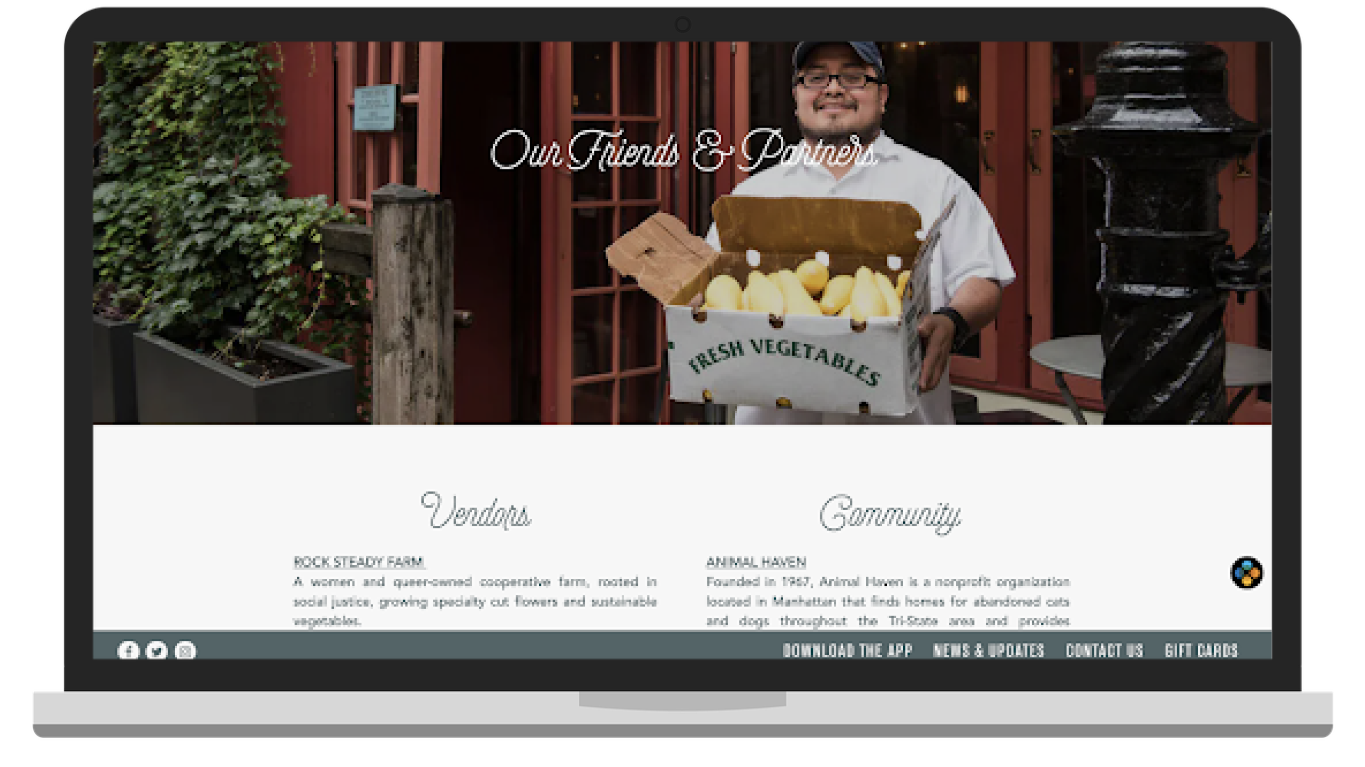
Image: The Grey Dog
Examples of the Best Restaurant Websites
1. Wings Over
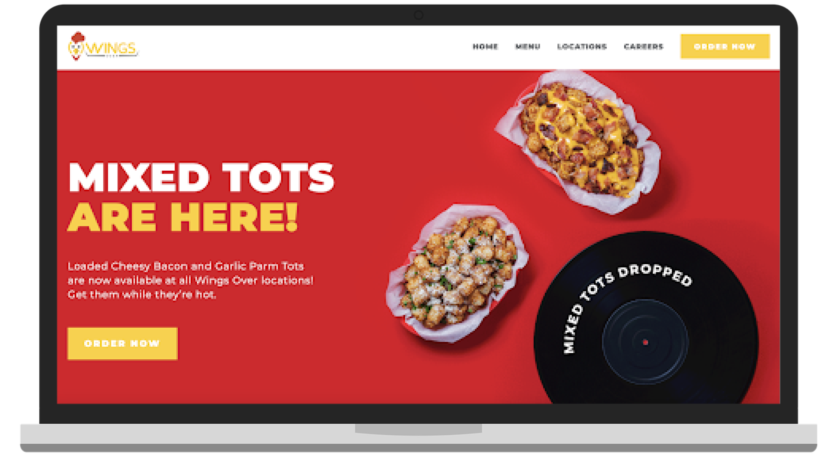
Wings Over is a fast-casual concept with over 40 locations, recently named on QSR’s hottest fast-casual startups list. On their website, Wings Over does an amazing job of implementing simple navigation, making it super easy for the customers to order ahead, and highlighting exciting new menu items in a rotating hero image at the top of the page.
2. Upper Crust Pizzeria
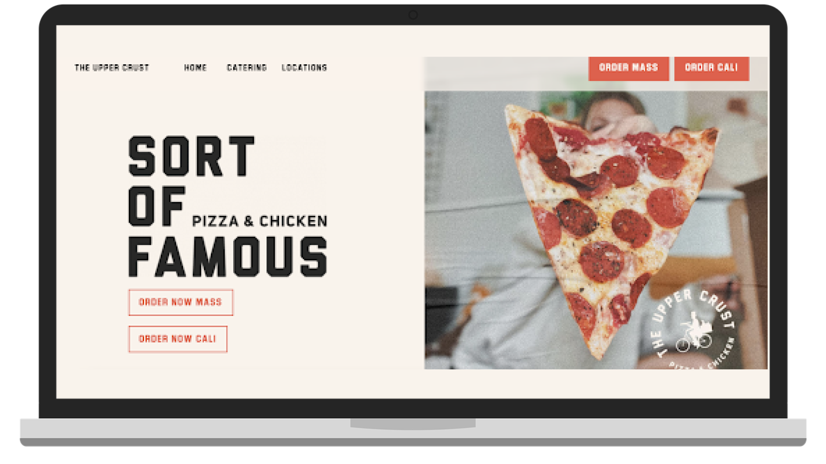
Upper Crust Pizzeria is a fast-casual pizza and chicken eatery with locations in Massachusetts and California. The brand recently went through a major overhaul and rebrand of their menu and stores, launching their new chicken menu with an all-new website. The website features links to order online and engages the customer to follow along with their social networks from their home page. The website is beautifully responsive and easy to navigate.
3. Go by Citizens
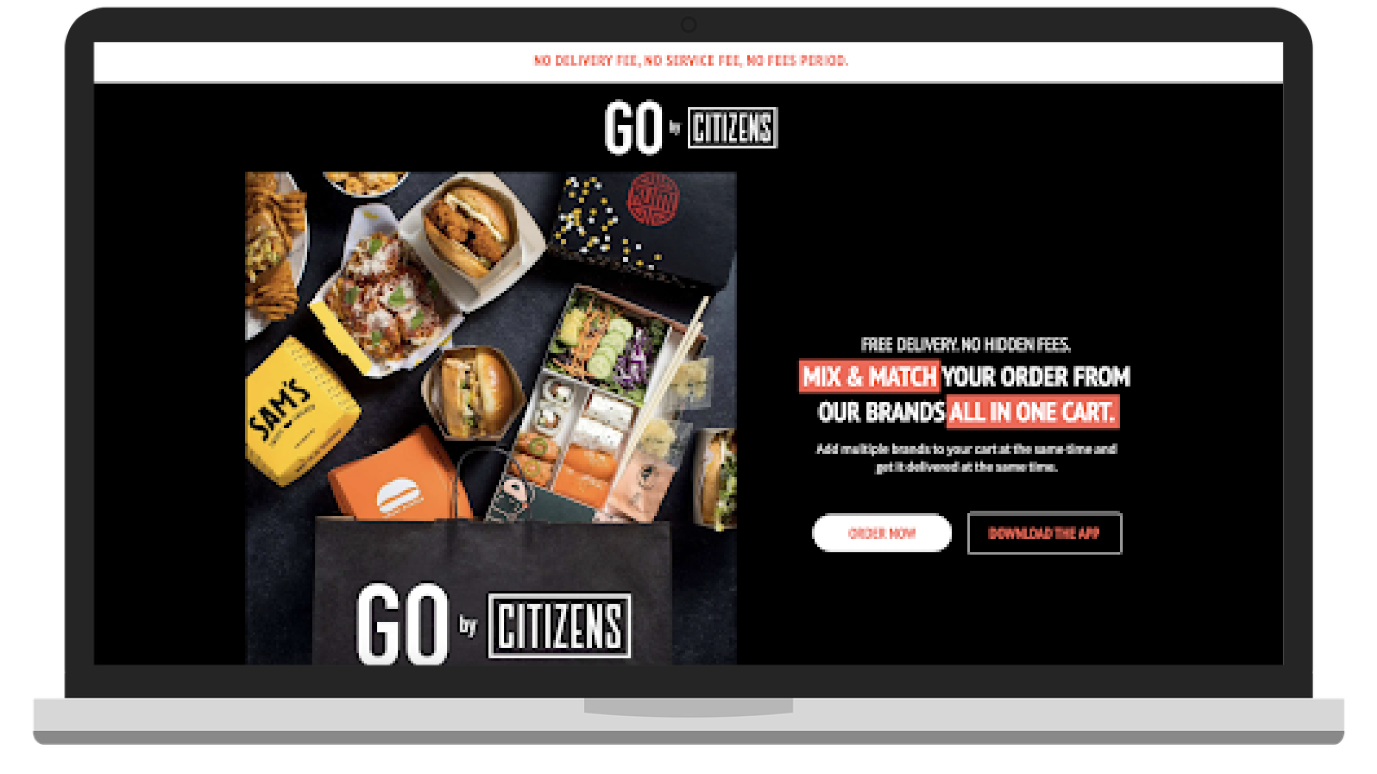
With virtual marketplace kitchens being fairly new to your average consumer, it is vital that these pioneering brands are able to quickly and simply communicate their value proposition. Go by Citizens does an impeccable job of getting the point across as soon as the customer lands on their website. The benefits of ordering from Citizens are clear: free delivery, no hidden fees, and multiple brands in one checkout cart. The food is front and center, and the action for the customer is also clear: order now or download the app.
4. 16 Handles
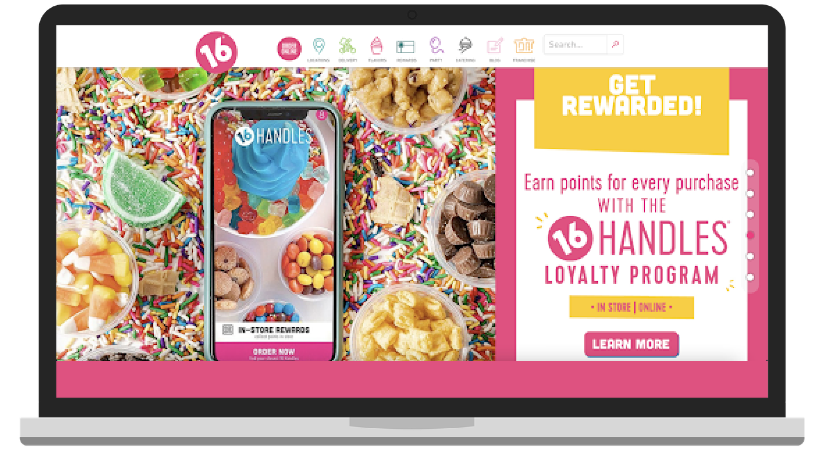
16 Handles is a frozen yogurt, smoothies, and soft serve ice cream concept. Their website does a great job of mimicking the bright, fun, and celebratory vibe of their brick and mortar stores using vibrant and high-quality menu photography complimented by their brand colors.
The sticky navigation at the top makes it easy to find the most important information quickly and the footer includes links to all of the 16 Handles social channels. Along the scroll you can find information about their loyalty program, environmental initiatives, and even search stores by available flavors.
And the cherry on top of this amazing website (pun intended)? A popup offer to unlock two free toppings with your next online order. A win, win – the customer gets a free treat, and 16 Handles gets a new subscriber and enrollment in their loyalty program.
Website Design Restaurants: Good Designs Are Simple
Web design for restaurants doesn’t need to be, and shouldn’t be, complicated. If you frame your digital approach to mimic your in-store experience, the pieces fall together naturally. If this were a plating exercise, you’d make sure you have your focal points set first: a menu, quality images, and a way for your returning and new customers to order from you. Once you have established the focus, you can start adding garnishes like social links, pop-ups, and loyalty program details. A good restaurant website design is that simple!